当前你的浏览器版本过低,网站已在兼容模式下运行,兼容模式仅提供最小功能支持,网站样式可能显示不正常。
请尽快升级浏览器以体验网站在线编辑、在线运行等功能。
2718:Typesetting
题目描述
Modern fonts are generally of two varieties: outline fonts, whose glyphs (the individual character shapes) are specified mathematically as a set of curves, and bitmap fonts, whose glyphs are specified as patterns of pixels. Fonts may also include embedded information such as kerning pairs (adjusting the spacing between certain pairs of glyphs, such as "AW", so that they appear spaced correctly), tracking hints (for managing inter-glyph spacing), antialiasing hints (smoothing of pixellated edges), and much more. To be sure, modern fonts are more than a simple collection of shapes, and displaying them properly is a common programming challenge.
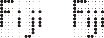
For this problem we will concern ourselves with bitmapped fonts and a simple form of typesetting called glyph packing. Essentially, the idea is to pack the glyphs as tightly as possible while maintaining at least one horizontal pixel of separation between glyphs. For example, consider the glyphs shown to the left below for the Roman characters "P" and "J". The figure to the right shows them after glyph packing. Note that they are as close as possible without touching horizontally.

Here's another example. In this case, notice that the final glyph cannot be packed at all.

After packing, pixels from distinct glyphs may be adjacent diagonally or vertically, but not horizontally. The following example shows that pixels may be adjacent diagonally. The "Love" test case in the example input section shows that they may be adjacent vertically.

Glyph packing has the nice property that it's easy to build "fancy" glyphs into the font so that glyph packing creates special effects with no extra work. Look at the "Toy" example below. The same simple packing process has been applied to these glyphs as to the ones above, but the result is more dramatic:

Glyph packing has a few caveats, however, one of which we must concern ourselves with for this problem. Consider the example on the left below where a glyph for a hyphen is followed by a glyph for an underscore. Based on our one horizontal pixel of separation rule, how would this pack? Clearly something more is needed, and that something more is hinting within the glyphs themselves. Recall that in actual practice, fonts contain kerning pairs, tracking hints, etc. For our purposes, our hinting will be limited to "invisible" pixels that count as a pixel for the purpose of packing, but not for display. The center image below represents invisible pixels as open dots instead of closed dots. Now the two glyphs can be properly packed, resulting in the output shown on the right.

Now for the formal definition of a proper packing: (1) Glyphs are packed as close as possible without allowing any pixels from different glyphs to be immediately horizontally adjacent; (2) Given two glyphs, they may not be packed in such a way that any pixel of the leftmost glyph at a given height ends up positioned to the right of any pixel at the same height in the rightmost glyph.
Condition (2) above is easily understood by visualizing two glyphs sitting side by side, separated by a small space. If you "squeeze" them together, condition (2) says that their pixels are not allowed to "pass through" one another. Consider the example to the left below. The center image is not the proper packing, because it violates condition (2) of the formal definition. The image on the right is the proper packing of these glyphs.

For this problem we will concern ourselves with bitmapped fonts and a simple form of typesetting called glyph packing. Essentially, the idea is to pack the glyphs as tightly as possible while maintaining at least one horizontal pixel of separation between glyphs. For example, consider the glyphs shown to the left below for the Roman characters "P" and "J". The figure to the right shows them after glyph packing. Note that they are as close as possible without touching horizontally.

Here's another example. In this case, notice that the final glyph cannot be packed at all.

After packing, pixels from distinct glyphs may be adjacent diagonally or vertically, but not horizontally. The following example shows that pixels may be adjacent diagonally. The "Love" test case in the example input section shows that they may be adjacent vertically.

Glyph packing has the nice property that it's easy to build "fancy" glyphs into the font so that glyph packing creates special effects with no extra work. Look at the "Toy" example below. The same simple packing process has been applied to these glyphs as to the ones above, but the result is more dramatic:

Glyph packing has a few caveats, however, one of which we must concern ourselves with for this problem. Consider the example on the left below where a glyph for a hyphen is followed by a glyph for an underscore. Based on our one horizontal pixel of separation rule, how would this pack? Clearly something more is needed, and that something more is hinting within the glyphs themselves. Recall that in actual practice, fonts contain kerning pairs, tracking hints, etc. For our purposes, our hinting will be limited to "invisible" pixels that count as a pixel for the purpose of packing, but not for display. The center image below represents invisible pixels as open dots instead of closed dots. Now the two glyphs can be properly packed, resulting in the output shown on the right.

Now for the formal definition of a proper packing: (1) Glyphs are packed as close as possible without allowing any pixels from different glyphs to be immediately horizontally adjacent; (2) Given two glyphs, they may not be packed in such a way that any pixel of the leftmost glyph at a given height ends up positioned to the right of any pixel at the same height in the rightmost glyph.
Condition (2) above is easily understood by visualizing two glyphs sitting side by side, separated by a small space. If you "squeeze" them together, condition (2) says that their pixels are not allowed to "pass through" one another. Consider the example to the left below. The center image is not the proper packing, because it violates condition (2) of the formal definition. The image on the right is the proper packing of these glyphs.

输入解释
The input for this problem is sets of glyphs to be packed. In a given test case, all glyphs are the same height, and an integer, N, on the first line of the test case specifies this height. The next N lines contain the glyphs to be packed. Empty pixels in a glyph are represented by a dot '.' character. Non-empty pixels are represented by a hash mark '#' for visible pixels, and a zero '0' for invisible pixels. Glyphs are separated by a single column of space characters. The input will always consist of more than one glyph, at least one of which will always contain at least one visible pixel. A glyph will always have at least one non-empty pixel in its leftmost and rightmost column, and every glyph will have at least one non-empty pixel at the same height as at least one other glyph in the input. The minimum dimension of a glyph is 1 × 1, the maximum dimension is 20 × 20, and the maximum number of glyphs that will appear in any test case is 20. Test cases continue until a value of zero is specified for N.
输出解释
For each test case, first output the number of that test case (starting with 1) on a line by itself. Then output the proper packing of the input glyphs, using the dot '.' character for empty pixels and for invisible pixels, and the hash mark '#' character for visible pixels. Omit leading and trailing empty columns (columns with no visible pixels) so that both the leftmost and rightmost output columns contain at least one visible pixel.
输入样例
8
###. ...#
#..# ...#
#..# ...#
###. ...#
#... ...#
#... ...#
#... #..#
#... ####
8
############# .... .............
..#.......... .... .............
..#.......... .##. .........#..#
..#.......... #..# .........#..#
..#.......... #..# .........#..#
..#.......... .##. ..........###
............. .... ............#
............. .... ############.
8
############# .............
..#.......... .............
..#.......... .........#..#
..#.......... .........#..#
..#.......... .........#..#
..#.......... ..........###
............. ............#
............. ############.
5
0..0 0..0
0..0 0..0
#### 0..0
0..0 0..0
0..0 ####
5
#.... .###.
#.... #...#
#...# #...#
#...# ....#
.###. ....#
3
### 0.0 ###
#.# 0.0 #.#
### 0.0 ###
3
0.0 ### 0.0
0.0 #.# 0.0
0.0 ### 0.0
8
#.... .... ..... ....
#.... .... ..... ....
#.... .##. #...# .##.
#.... #..# .#.#. #..#
#.... #..# .#.#. #..#
#.... #..# .#.#. ###.
#.... .##. ..#.. #...
##### .... ..#.. .###
0
输出样例
1
###..#
#..#.#
#..#.#
###..#
#....#
#....#
#.#..#
#.####
2
#############
..#..........
..#..##..#..#
..#.#..#.#..#
..#.#..#.#..#
..#..##...###
............#
############.
3
.....#############
.......#..........
.......#.#..#.....
.......#.#..#.....
.......#.#..#.....
.......#..###.....
............#.....
############......
4
.........
.........
####.....
.........
.....####
5
#......###.
#.....#...#
#...#.#...#
#...#.....#
.###......#
6
###.....###
#.#.....#.#
###.....###
7
###
#.#
###
8
#..............
#..............
#..##.#...#.##.
#.#..#.#.#.#..#
#.#..#.#.#.#..#
#.#..#.#.#.###.
#..##...#..#...
#####...#...###
来自杭电HDUOJ的附加信息
| Recommend | teddy |
最后修改于 2020-10-25T22:56:12+00:00 由爬虫自动更新
共提交 0 次
通过率 --%
| 时间上限 | 内存上限 |
| 2000/1000MS(Java/Others) | 32768/32768K(Java/Others) |
登陆或注册以提交代码